Logo
Logo Usage
Proper Logo Usage
To ensure consistency, always follow the guidelines outlined here when incorporating the logo into any design.
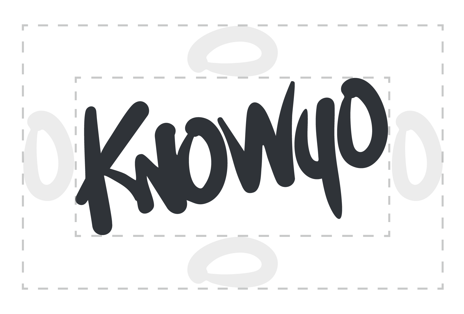
Safe Space
For breathing room and white space, allow an “O” width around the logo when placing in layouts.
Minimum Size
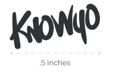
The size below illustrates the smallest size the logo can go without losing legibility.
What Not to Do
The examples below illustrate ways in which the logo should not be used:

Do not change the logo’s orientation or rotation.
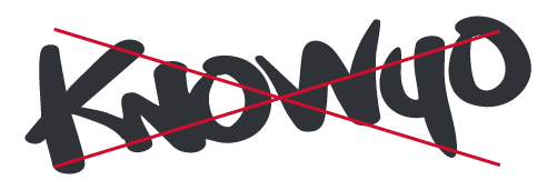
Do not disproportionately scale or resize the logo.
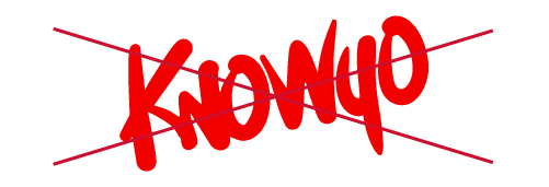
Do not change the logo’s colors.
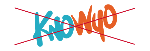
Do not display the logo with color combinations not previously specified.
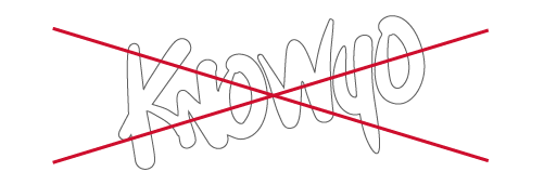
Do not add an outline to the logo or display the logo as an outline.
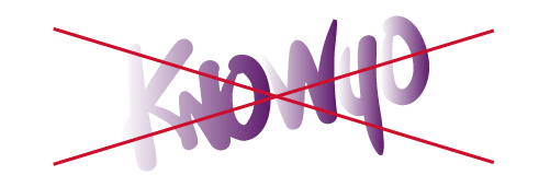
Do not add special effects to the logo.
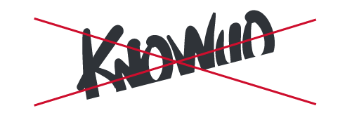
Do not crop the logo in any way.
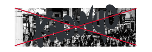
Do not use the logo on top of busy photography.
Primary Logo
To avoid color bounce, the Teal logo should only be used against the dark gray or white background.
Use the Dark Gray logo against the dark gray, teal, or orange background.

To avoid color bounce, the Orange logo should only be used against the dark gray or white background.
The Yellow logo should only be used against the dark gray background
This logo color should be used sparingly, only for specific campaigns.

This logo color should be used sparingly, only for specific campaigns.
Use the White logo against the dark gray, teal, or orange background.
This download will include files for all of the above logos in .eps and .png formats.
To download these logos, you will need the ability to open a .ZIP file.
URL Logo
Various lockups can be used depending on the space available in the layout.
This download will include files for the above logos in .eps and .png formats.
To download these logos, you will need the ability to open a .ZIP file.
Tab TOP Logo Lock-Up


Use the top KnoWyo tab at the top of print and digital layouts for consistent brand placement and style. The size of the logo in proportion to the tab may be edited depending on layout sizing. (See example layouts for placement.)
This download will include files for all of the above logos in .eps and .png formats.
To download these logos, you will need the ability to open a .ZIP file.
Tab Bottom Logo Lock-Up


Use the bottom KnoWyo tab at the bottom of print and digital layouts for consistent brand placement and style. The size of the logo in proportion to the tab may be edited depending on layout sizing. (See example layouts for placement)
This download will include files for all of the above logos in .eps and .png formats.
To download these logos, you will need the ability to open a .ZIP file.
Get Some Campaign Logo



The Get Some logo should not be used on its own; it must be paired with Get Tested, Condoms, or some descriptor. Get Some can be placed on a condom to create a CTA design element, or placed as a headline within a layout. (See example layouts for placement, See Elements for Condom lockup.)
If typesetting a new lockup word, use Barlow Semi Condensed Extra Bold, with kerning set at 50 pts.
This download will include files for the above logo in .eps and .png formats.
To download these logos, you will need the ability to open a .ZIP file.
Get Some Campaign Logo – Spanish Version


The Get Some logo should not be used on its own; it must be paired with Get Tested, Condoms, or some descriptor. Get Some can be placed on a condom to create a CTA design element, or placed as a headline within a layout. (See example layouts for placement, See Elements for Condom lockup.)
If typesetting a new lockup word, use Barlow Semi Condensed Extra Bold, with kerning set at 50 pts.
This download will include files for the above logo in .eps and .png formats.
To download these logos, you will need the ability to open a .ZIP file.